Hello crafty friends! Today I’m sharing a card that embraces all the things I love about mixed media: layers of paint, plenty of texture, and a beautifully distressed finish.

Sometimes the most interesting backgrounds come from simply experimenting with color and letting the layers build naturally. For this project, I reached for my PaperArtsy Fresco Paints and some beautiful Alison Bomber designs to create a card with a vintage, weathered feel.
🎨 Building a Grungy Background
I started by creating the background with a combination of PaperArtsy Fresco Finish Acrylic Paints in Beach Hut, Mud Splat, Mulled Wine, and Pumice.
Using a brayer, I rolled the colors across my cardstock, allowing the layers to overlap and peek through one another. I love how this technique creates an imperfect, textured look that feels naturally aged and full of character.

Once the first layers were dry, I reached for the PaperArtsy Alison Bomber PS523 stencil and added even more texture by pouncing paint through the design with a dauber. Those extra marks brought movement and depth to the background and helped tie all the colors together.
✨ Adding Layers of Detail
With the background complete, I stamped one of the beautiful images from the PaperArtsy Alison Bomber 59 stamp set using Lavinia Truffle Ink.

These subtle details add another layer of interest without overwhelming the background. One of my favorite things about distressed projects is how each layer peeks through the next, creating little surprises as you look closer.
🌹 Creating the Focal Point
For the focal image, I stamped the rose from the same stamp set onto a separate gel print and carefully fussy cut it.
To give the flower a bit more dimension, I pulled out my colored pencils and added shading to the petals along with touches of green on the leaves. I love how just a few extra strokes of color can bring a stamped image to life and help it stand out against a busy background.

Once the rose was finished, I added a sentiment stamped in Versafine Clair Twilight and began assembling the card.
💌 Finishing Touches
To complete the design, I added:
- Gold and white paint splatters for a little extra contrast
- A hand-drawn frame to define the composition
- Simple layering that lets the rose remain the star of the card

Those final details brought everything together and added just the right amount of grungy charm.
💡 A Little Creative Challenge
The next time you’re creating a background, try letting go of perfection and embrace the unexpected.
🌹 Layer several paint colors with a brayer.
🌹 Add texture with a stencil and dauber.
🌹 Stamp your focal image on a leftover gel print instead of plain cardstock.
You may discover that the imperfect marks and distressed layers become your favorite part of the project.

Thank you so much for stopping by today! I hope this card inspires you to pull out your paints, experiment with texture, and create something beautifully grungy.
Have a wonderful day and happy crafting! 🌹✨
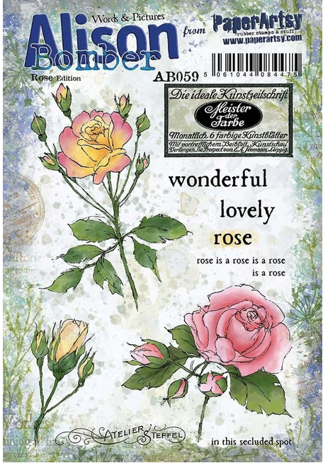 PaperArtsy – Alison Bomber 59 Shop at: CSTP |
 PaperArtsy – Alison Bomber PS523 Shop at: TP |
 WOW! Embossing – Clear Shop at: WOW US | TP |
 WOW! Embossing – Clear Embossing Pad Shop at: WOW US | TP |
 Lavinia – Elements Dye Ink – Truffle Shop at: TP |
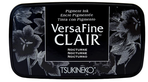 Tsukineko – VersaFine Clair – Nocturn Shop at: AZ | TP |
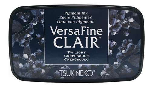 Tsukineko – Versafine Clair – Twilight Shop at: TP |
 PaperArtsy – Fresco Chalk Paint – Beach Hut Shop at: TP |
 PaperArtsy – Fresco Chalk Paint – Mud Splat Shop at: TP | |
 PaperArtsy – Fresco Chalk Paint – Mulled Wine Shop at: TP |
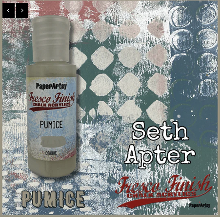 PaperArtsy – Fresco Chalk Paint – Seth Apter Pumice Shop at: TP |
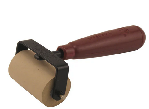 Speedball – 2″ Brayer Shop at: TP |