Hello crafty friends! Today I’m spending some time in my art journal, experimenting with two of my favorite mixed media products—Lindy’s Gang Starburst Sprays and PaperArtsy Infusions.
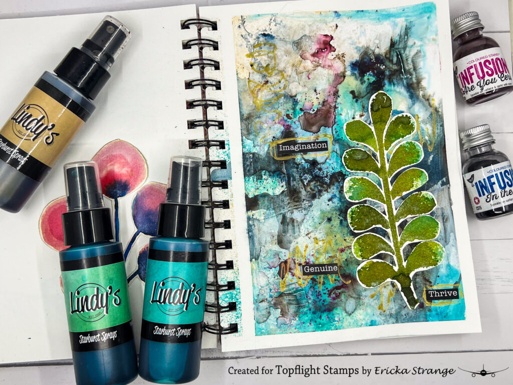
Both of these products create incredible effects, but they each bring something completely different to a project. The Starburst Sprays add vibrant color and beautiful shimmer, while the Infusions introduce rich, moody tones and a touch of grunge. Combining the two is one of my favorite ways to create backgrounds full of depth and unexpected details.
✨ Why I Love These Products
One of the things I love most about Lindy’s Gang Starburst Sprays is the incredible variety of colors and finishes available. Whether you choose the sprays or powders, the colors can be soft and dreamy or bright and sparkling, depending on the look you’re after.
PaperArtsy Infusions bring something entirely different to the table. The combination of dye pigments and walnut crystals creates darker, more distressed effects that add beautiful contrast and texture to any background.
Together, they create the perfect balance between vibrant color and vintage grunge.
🎨 Building the Background
To begin my journal page, I taped off the edges and applied a layer of gesso.
While the gesso was still slightly wet, I sprayed Lindy’s Gang Steampunk Sepia and Time Travel Teal from the Industrial Chic collection across the page.
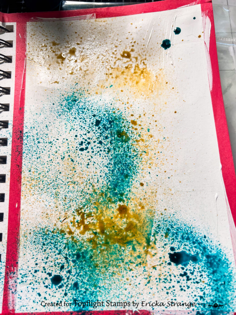
A light mist of water helped the colors blend and flow together, creating soft transitions and interesting patterns.
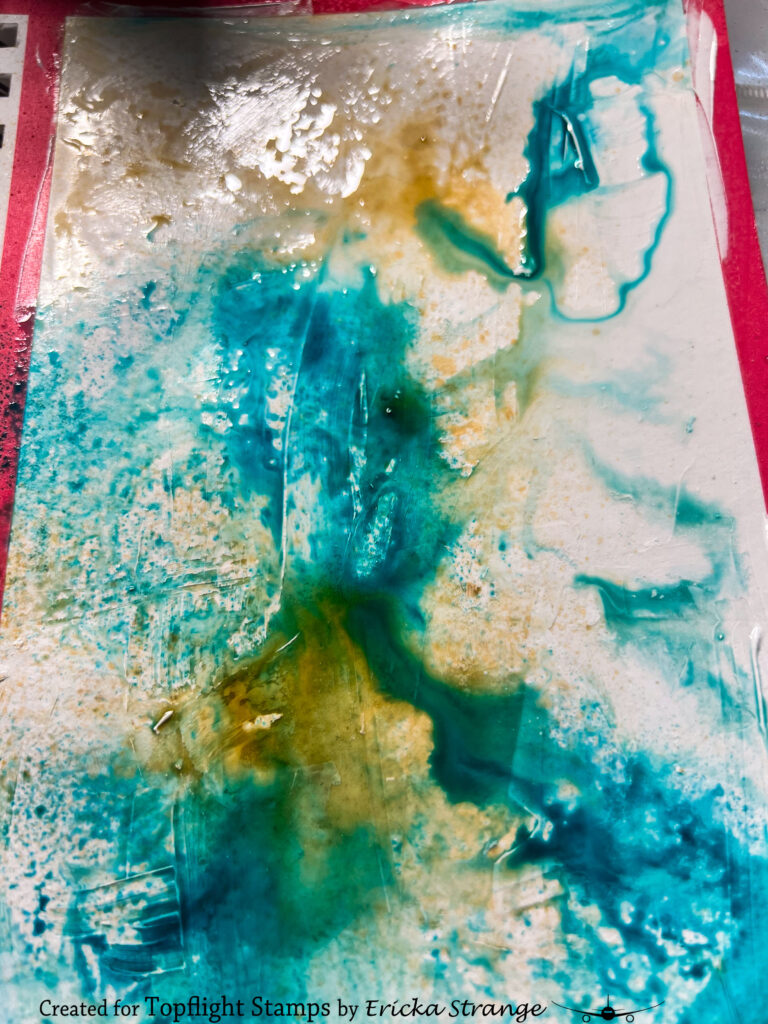
After setting the page aside to dry, I sprinkled on PaperArtsy Infusions in In the Navy with just a touch of Cerise. A quick spritz of water activated the pigments and walnut crystals, adding rich layers and a distressed look to the background.
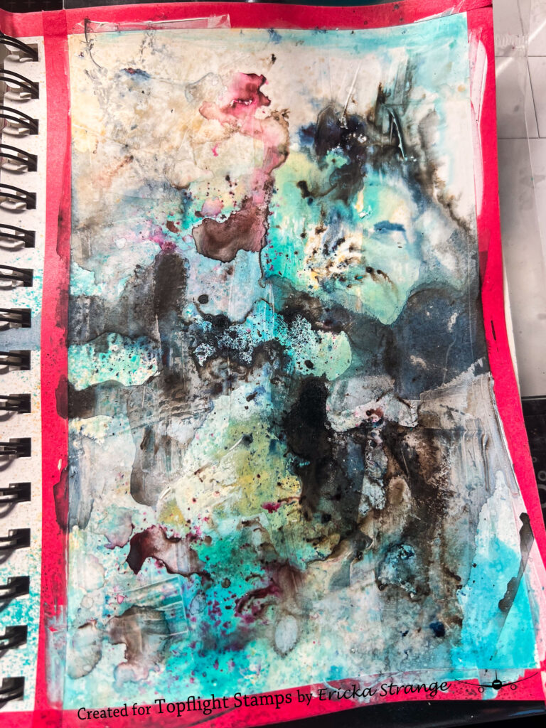
One of my favorite things about working with sprays and Infusions is that no two pages ever turn out exactly the same.
🍃 Creating the Focal Elements
While the background dried, I created some coordinating embellishments on watercolor paper using the PaperArtsy Tracy Scott 226 stencil. For color, I reached for Rusty Lantern Lime and Shabby Turbine Teal sprays, allowing the vibrant shades to contrast against the darker journal background.
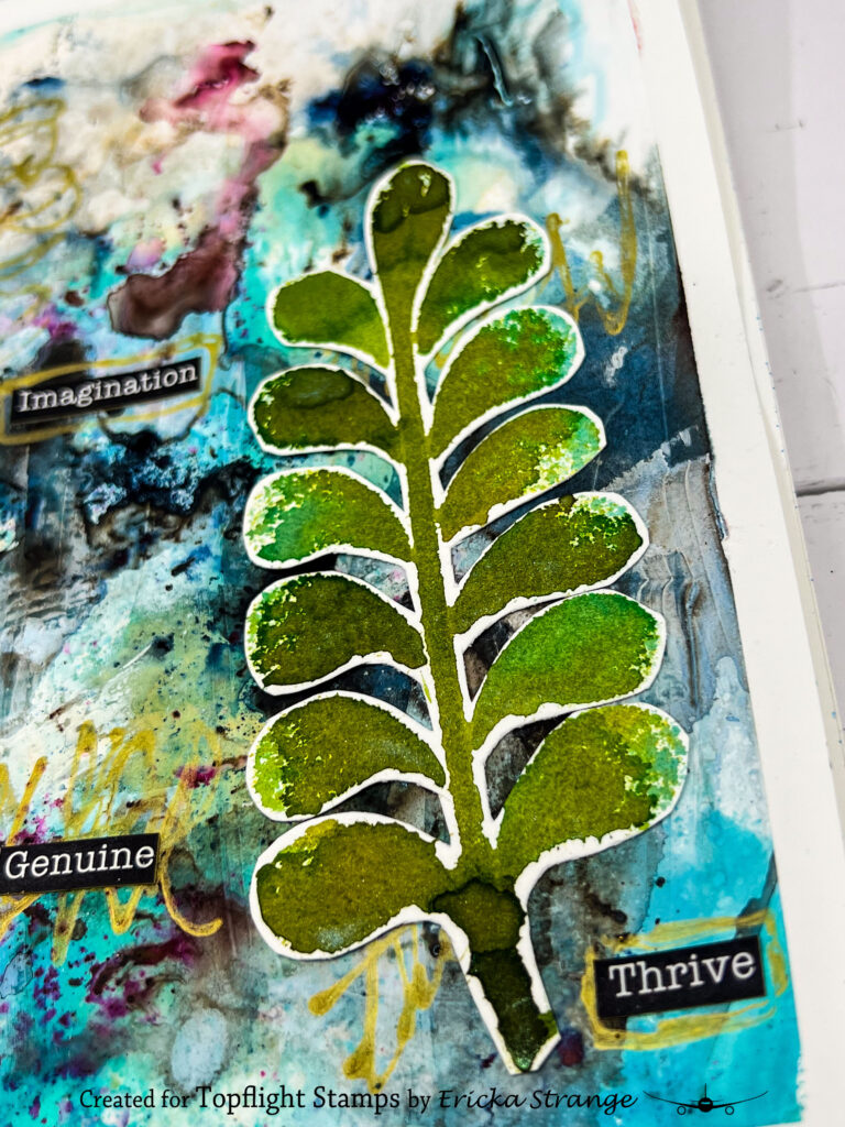
Once everything was dry, I carefully cut it out and arranged it on the page.
✍️ Finishing Touches
To complete the spread, I added:
- Sentiments from AALL & Create’s Motivation Station
- Highlights with a gold pen
- Extra layers to bring movement and balance to the page
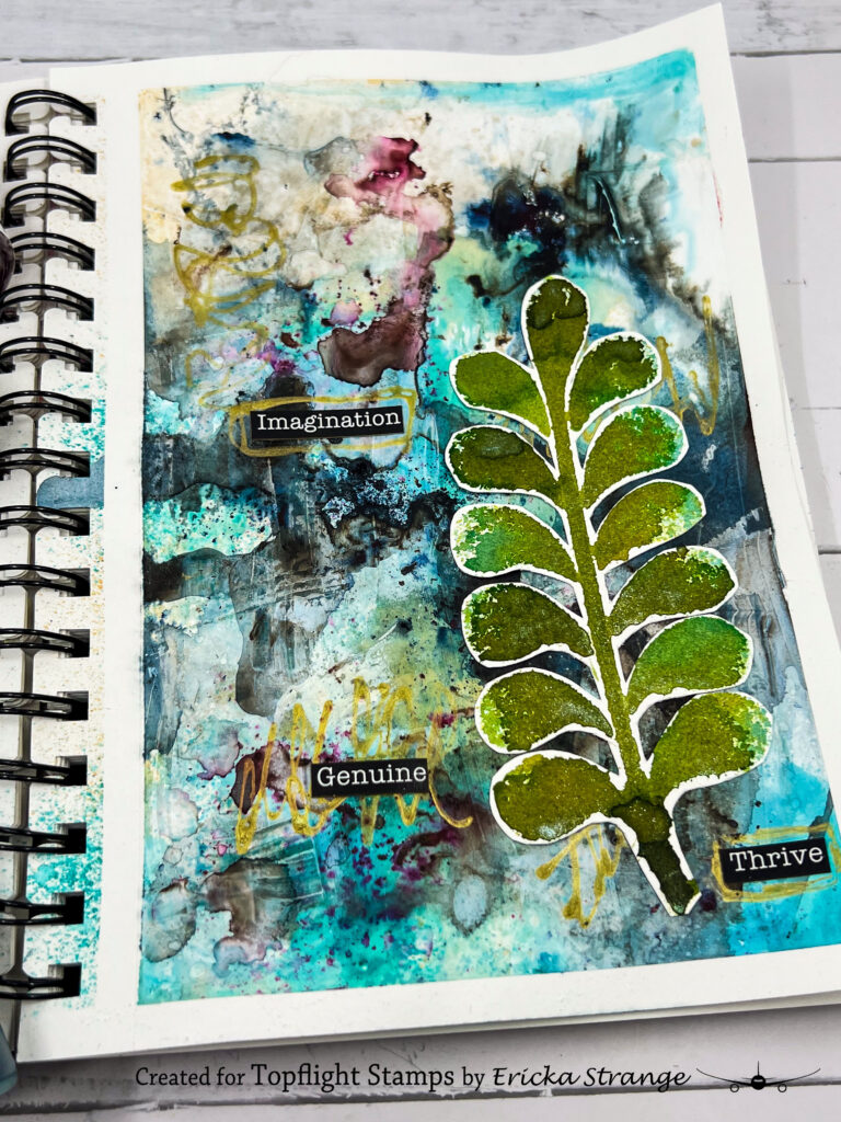
Those final details tied everything together and added a little extra sparkle to the grungy background.
💡 A Little Creative Challenge
The next time you sit down to create, try combining two products that seem completely different.
🎨 Pair bright sprays with distressed pigments.
💧 Let water create unexpected patterns.
✨ Experiment with color combinations you wouldn’t normally choose.
Sometimes the most interesting projects happen when vibrant color meets a little bit of grunge.
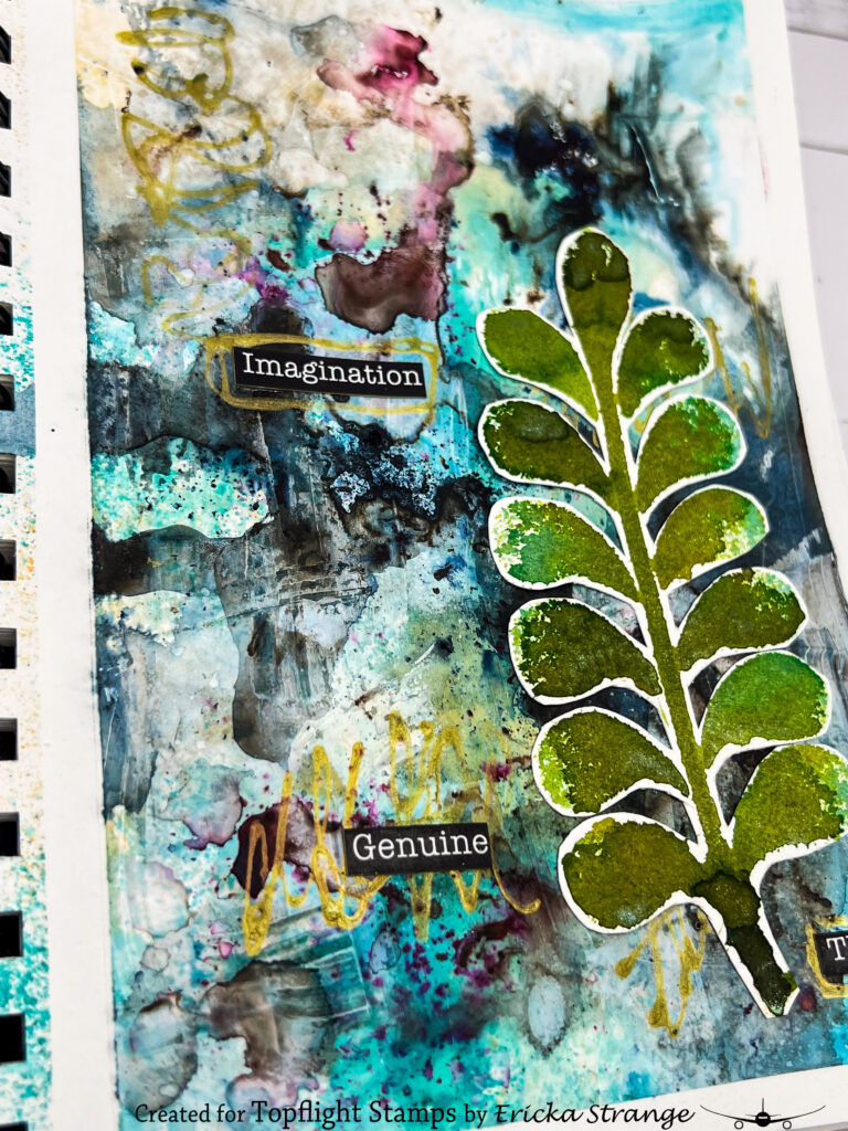
Thank you so much for stopping by today! I hope this journal page inspires you to pull out your sprays, embrace the unexpected, and spend some time experimenting in your art journal.
Have a wonderful week and happy creating! 💙✨
 PaperArtsy – Tracy Scott PS226 Shop at: TP |
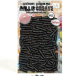 AALL & Create – Motivation Station Shop at: TP |
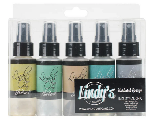 Lindy’s Gang – Industrial Chic Sprays Shop at: Lindys | TP |
 PaperArtsy – Infusions Dye – Cerise Shop at: TP |
 PaperArtsy – Infusions Dye – In the Navy Shop at: TP |